
Texecom Connect App
The Project
– The redesign of the UI on the Texecom Connect App
– Improving form and functionality throughout the App
The Inspiration
The main source inspiration for the re-work of the app came from Nordic/Scandinavian design, which is characterised by its simplicity, minimalism and functionality. Key factors in which I feel Texecom Connect would greatly benefit from. We need to provide an interface that is easy to use and understand, versatile to cater towards our various target markets and also responsive in panic situations.
The use of boxes to clearly layout different sections of content on the page makes it easy for the user to quickly identify the information they are looking for or the action they wish to perform. Nordic design is renowned for functionality over form, the superfluous knick-knacks that serve no real purpose are jettisoned in favour of its ultimate function.
Minimalistic Typography
Clean, plain typeface is a must when it comes to implementing minimalism to UX. First and foremost, keep it consistent: using more than one type of font is just messy, and not in keeping with the minimalist aesthetic.
Instead of using various fonts for different uses, such as Headings, Sub-headings and body copy, the new Connect App design utilises one font at various weights and sizes to emphasise key information.
Simple Colour Scheme
Typically, in Nordic design , a maximum of 3 colours would be used throughout. However, with Connect, importance to elevate certain situations is a must – so a range of highlighting colours have been used on top of the base colour scheme of the monochromatic blues. These highlighting colours do however, compliment the base colour scheme and don’t come across as loud, keeping with the overall design.
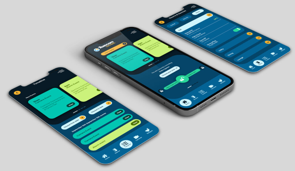
Key Features
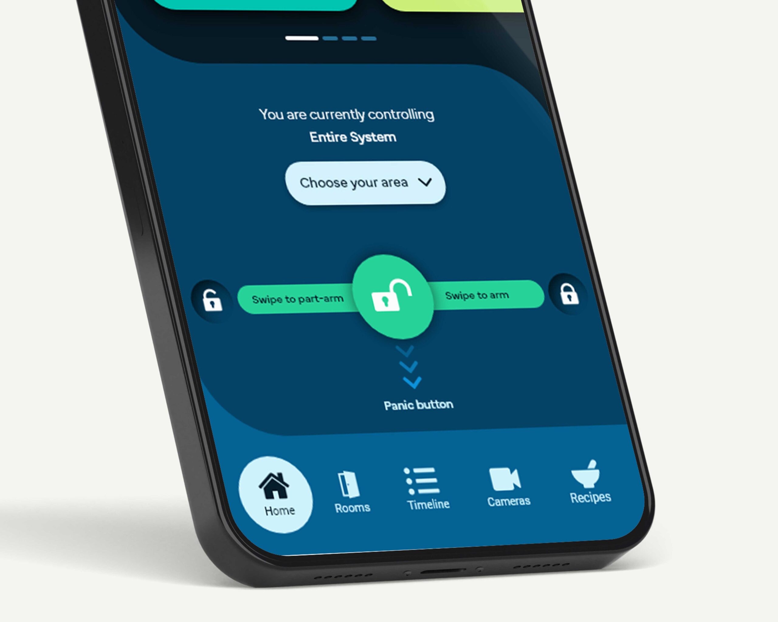
Arm and disarm slider
To Arm, Disarm & Part-arm the system, we have introduced a slider button. This is a familiar function that is already in use across a variety of operating systems to unlock a device. Furthermore, the slider gives the user a way to quickly see the options that are available to them. Unlike a normal button, which can be accidentally pressed without knowing, the slider is a deliberate action which the user has to perform to achieve their goal.
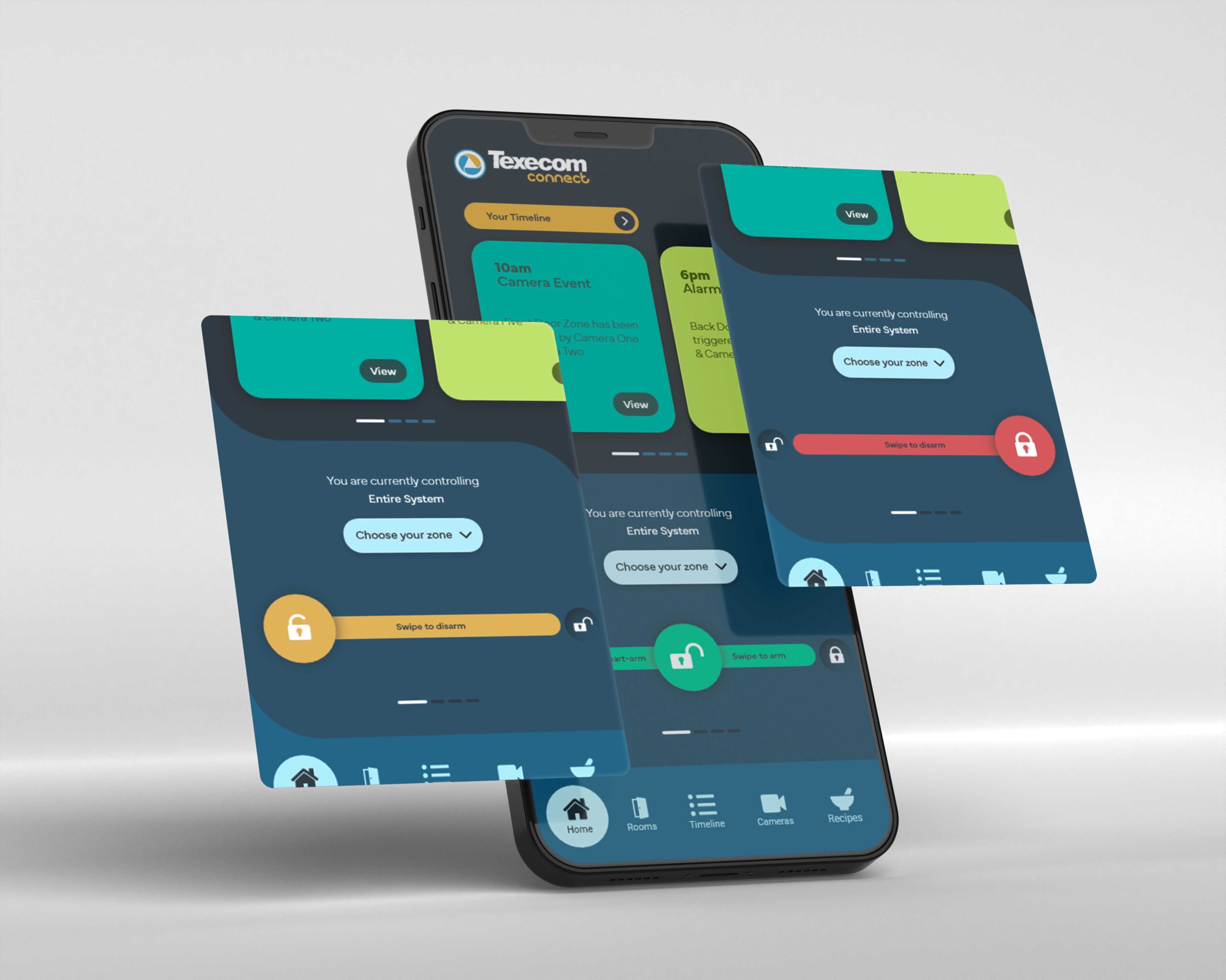
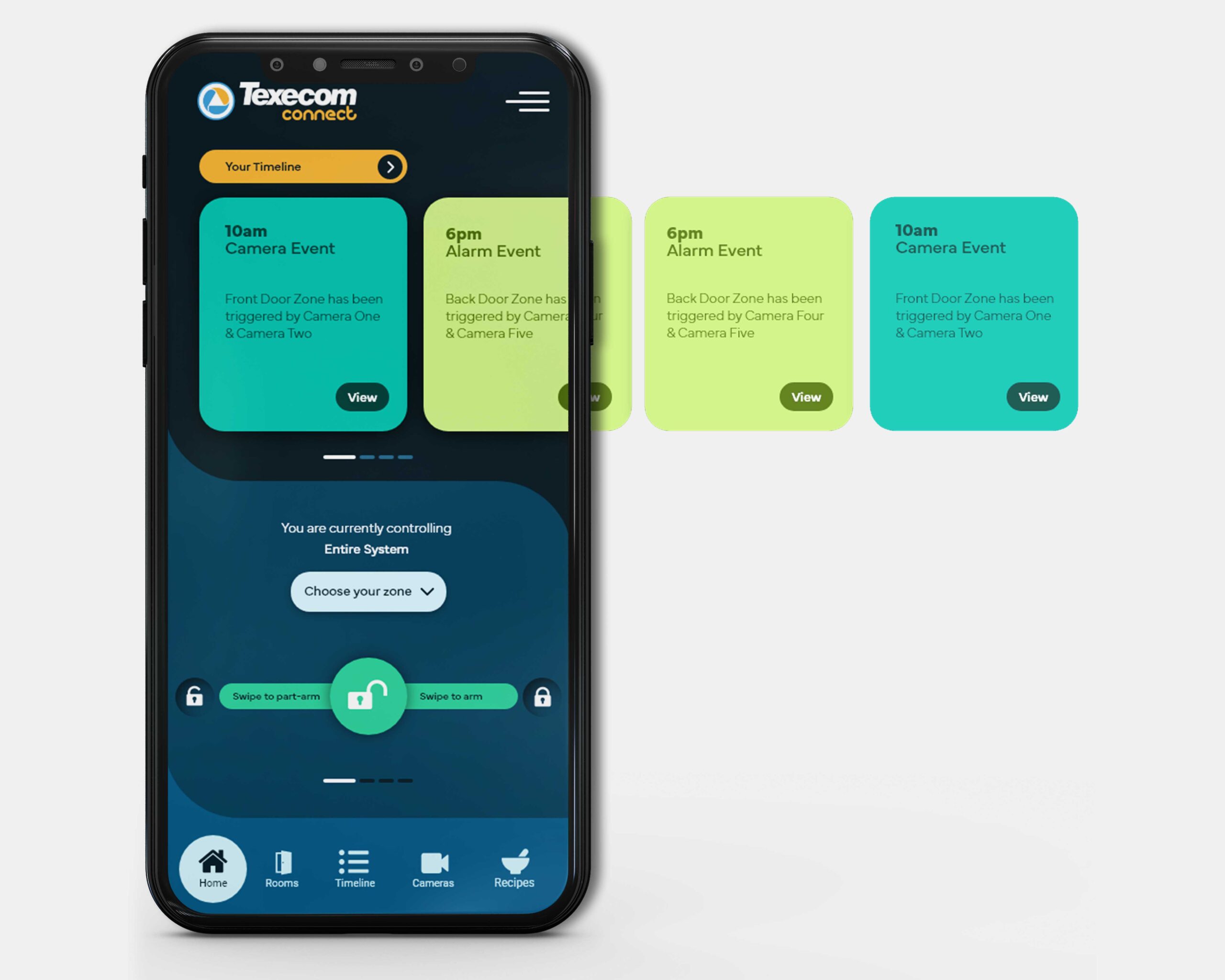
Notification horizontal scroll
Instead of using the current circle timeline which appears on the Homepage, we have replaced it with a section that displays the latest alerts as cards, which can also be scrolled by the user to reveal past notifications. The current display has been a cause of debate, with some uses stating that it is confusing and takes up a lot of unnecessary space. The new design combats this but still provides the user with more information for each notification in a clear and concise manner. Whilst also providing them with the ability to use the app with one finger/thumb, making it a lot easy to browse the notifications and view each one.
Panic Button
Utilising the slider button that already exists to arm and disarm the system, I feel it would be interesting to also introduce a functionality where the user could slide down to activate the Panic Button.
This would still require a deliberate action from the user, so the idea would be to slide down and hold for a period of time to activate.
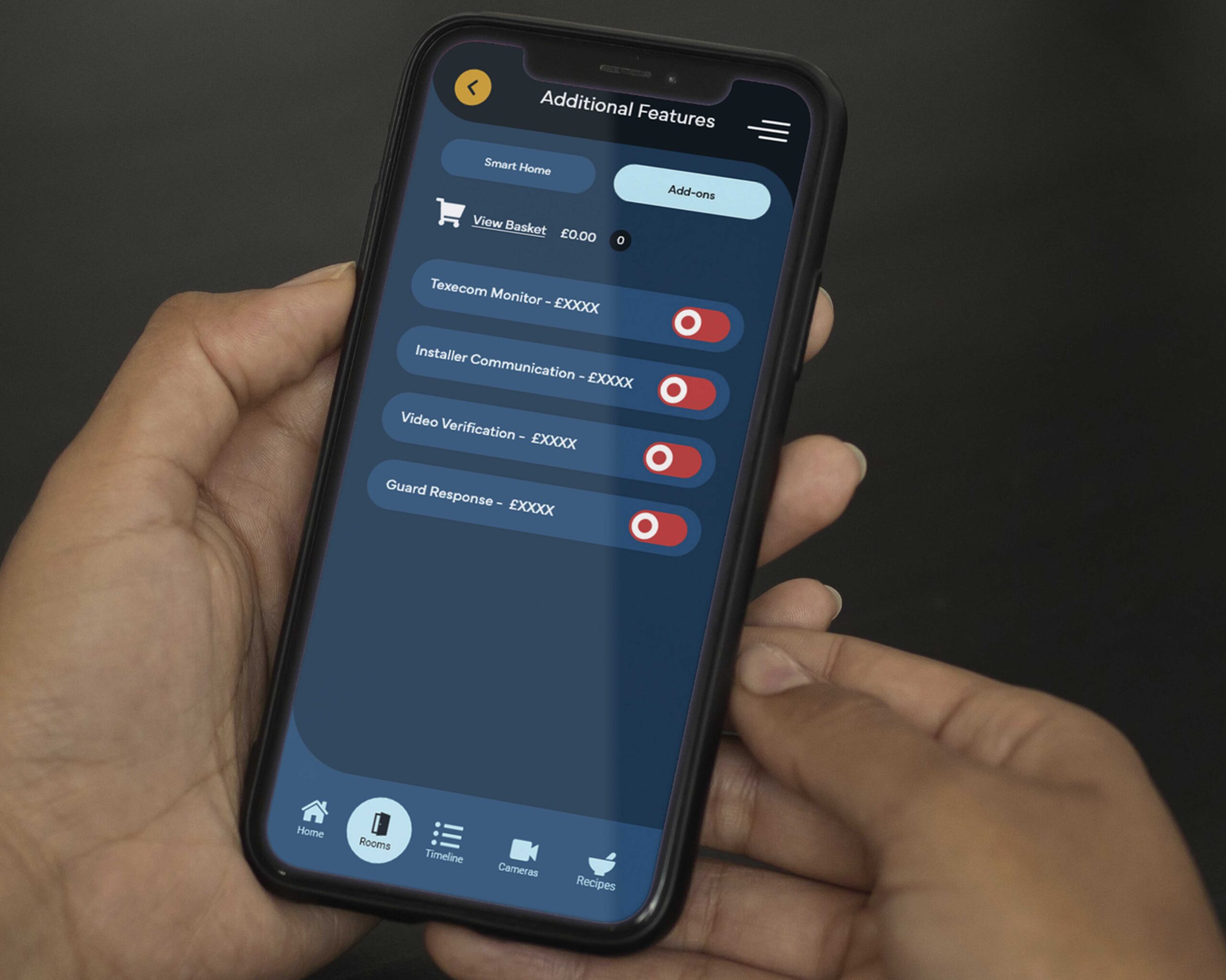
End-User Portal Concept
This is an area of the Connect App where the user can add ‘Additional Features’ to enhance their product. This will include features, such as, Texecom Monitor, Installer to end user communication, Video Verification and Guard response.
At the moment, this section is behind the Additional Features option in the flyout navigation menu. At this stage, all wording and placement are subject to change upon testing the prototype.